We’ve explained previously why renewable energy is getting cheaper all the time, but if you found it challenging to spot the patterns among all those figures and numbers, the following charts will make everything much clearer.
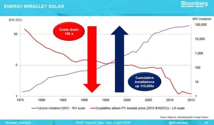
The first was shared by Bloomberg New Energy Finance (BNEF) Chairman Michael Liebreich back in April during BNEF’s annual conference called “In Search of the Miraculous.” What we’re looking at is the solar panel cost per installed Watt (red) versus the scale of deployment or installed solar capacity in MegaWatt (MW) plotted over the last forty years.
Since 1975, the cost of solar has dropped 150-fold while installed solar capacity has jumped 115,000-fold. Granted, there was a lot of ground to cover and picking the low hanging fruit was pretty easy up until a decade ago. But the momentum solar has gathered doesn’t seem to show any signs of slowing down soon. So, there’s reason to believe that these two curves can follow the same trend lines for a couple of years still until the improvements gradually become incremental, instead of exponential. Here’s where the second graph comes in.
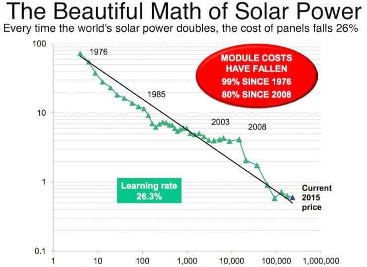
The graph above illustrates a learning rate which basically means that for every doubling in the scale of the solar industry, the price of solar modules has dropped roughly 26 percent. “The chart is arguably the most important chart in energy markets. It describes a pattern so consistent, and so powerful, that industries set their clocks by it,” reads BNEF’s New Energy Outlook report from June, 2016.
In 2015, 30 million Americans enjoyed solar power cheaper than the grid. Also in the US, solar power is cheaper than fossil fuels even without subsidies in many states while coal, gas or oil receive subsidies worth $452 billion each year across G20 states. Earlier this month, Chile signed a deal for a new solar plant for 2.91$c/kWh — that’s the cheapest unsubsidized power plant in the world so far.
Many thanks to ThinkProgress‘ Dr. Joe Romm for digging these charts.
Was this helpful?


