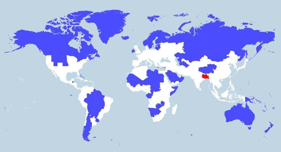
The mind blowing map shows just how disproportionate human population is in regard to the area it occupies. It may seem hard to believe, but the blue area and the red area actually have just as much population: 5%, to be more exact.
The map was created by self-proclaimed data-cruncher Max Galka, and from the data I found, it’s quite accurate. The blue area, which includes Canada, Australia, 9 US states, much of South America, most of Russia and Scandinavia has 5 percent of the world’s population. The red area, which has only Bangladesh and and three eastern Indian states: Bihar, Jharkhand, and West Bengal.
The map was created using open-source mapping tool QGIS, and used data from the Credit Suisse Global Wealth Databook. Galka said that he tried to include full countries in the blue area as often as possible, but sometimes it was difficult to round the numbers out that way. You can see all data yourself over at Galka’s website.
“What I find most interesting is that such a dense population centre can be in a area that has so little global prominence,” Galka said in an interview for io9. “Bangladesh is the seventh most populous country in the world, but how many people could even locate it on a map?”
What do you think about this map? All that landmass has just as much population as Bangladesh as a bit of India – something which most people wouldn’t even be able to locate on a map. Galka said he thinks it’s a good thing, because crowded societies tend to be more efficient – what do you think?


