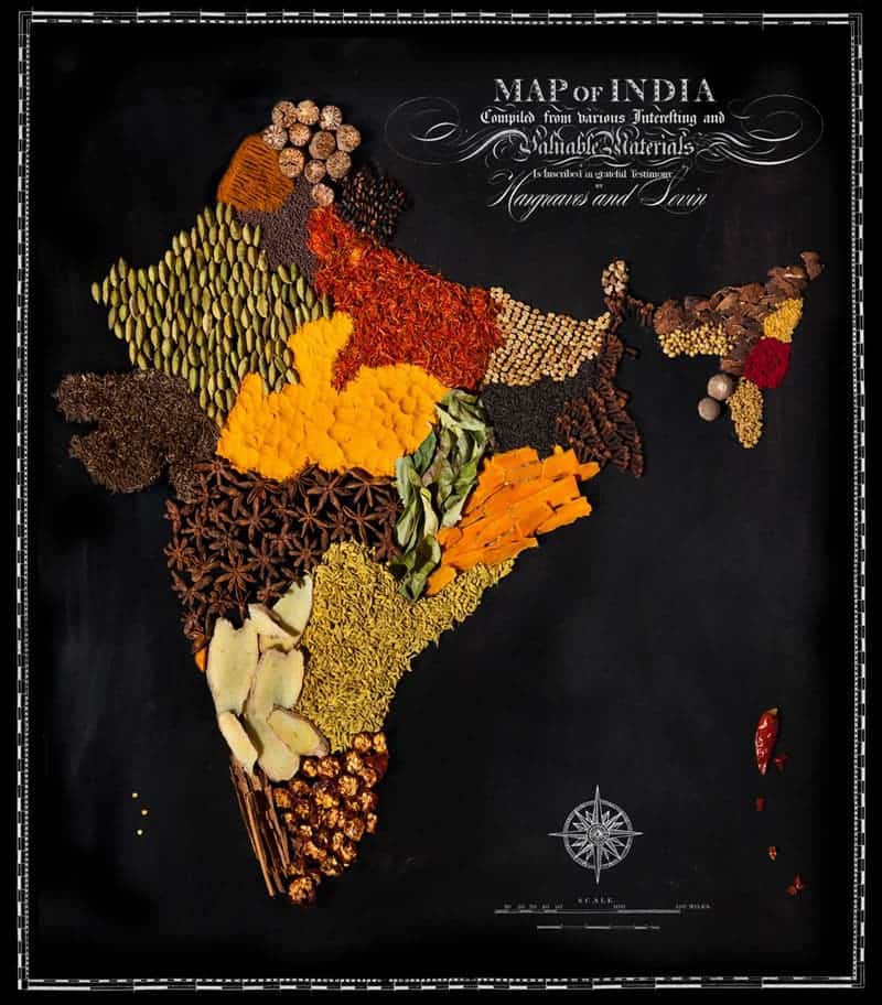
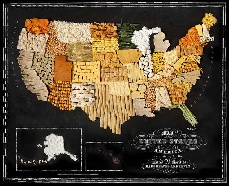
Caitlin Levin and Henry Hargreaves, use regional foods to create physical maps of countries and continents around the world. This doesn’t mean that the food originally came from that country, just that it is heavily incorporated in the country’s diet.
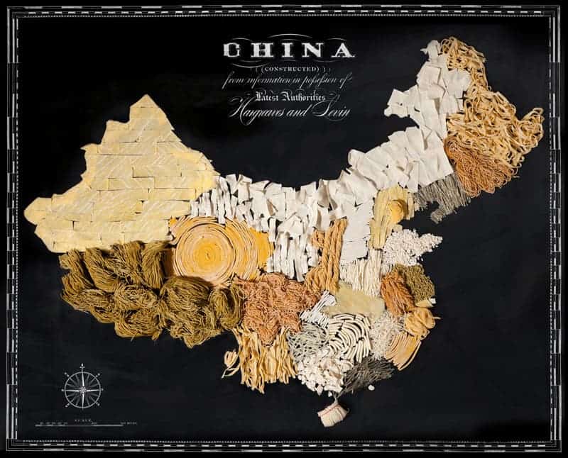
Exploring new places through the food you eat is often a portal to the cultural complexities of that place… While we know that tomatoes originally came from the Andes in South America, Italy has become the tomato king. These maps show how food has travelled the globe—transforming and becoming a part of the cultural identity of that place… This project speaks to the universality of how food unites people, brings us together and starts conversation.
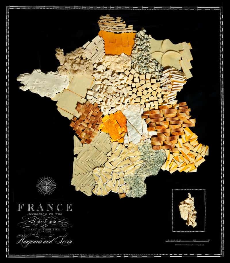
So, if you’re living in one of these countries, do you think the depiction is accurate? What (if anything) would you change?
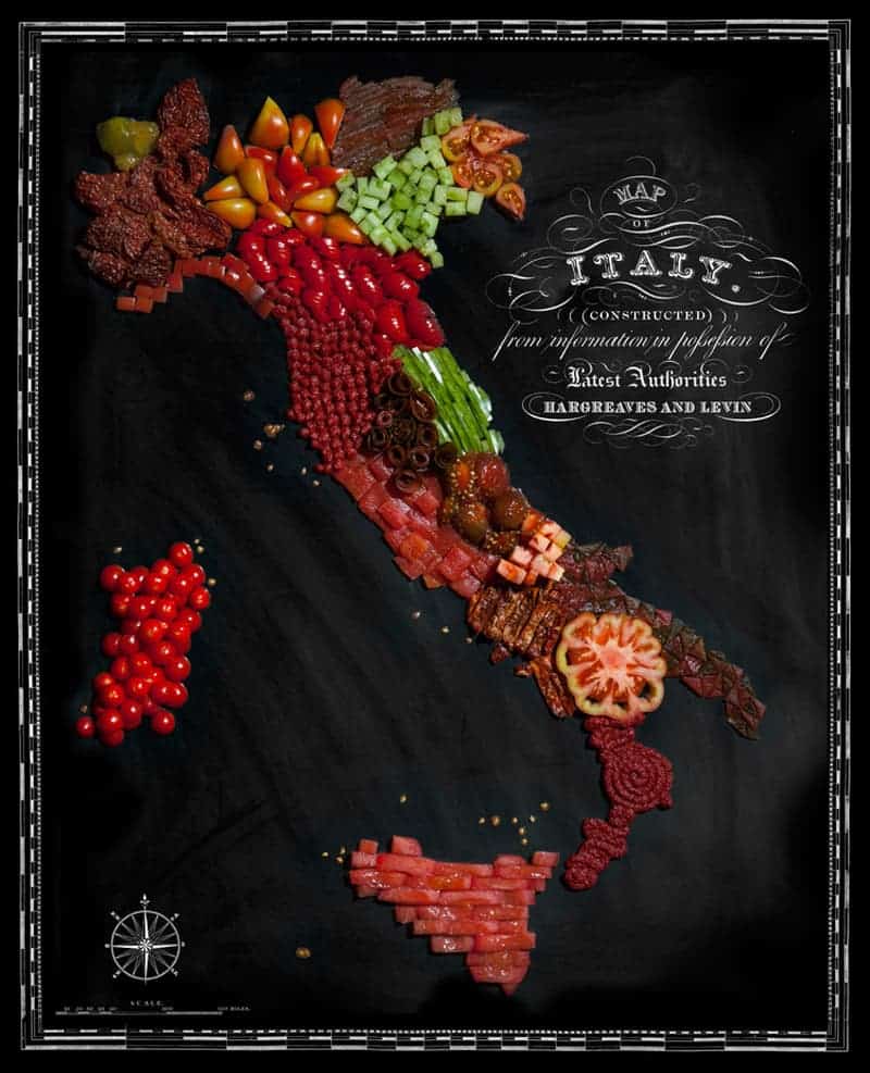
Hey, and for the rest of us, the non-Indian/Chinese/French/Italian/American, what would such a map of your country be made of?


