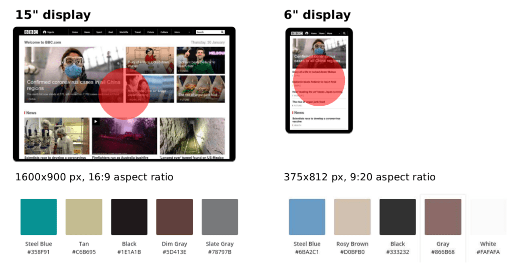
The common understanding of what attracts visual attention to screens doesn’t transfer to mobile applications, according to a new study, the first one to look at how users’ eyes follow mobile app elements. Larger and brighter elements just don’t catch our eyes after all, researches argued.

As part of an international collaboration, Aalto University researchers carried out the first study to empirically test how we interact with mobile apps. Previous studies on what attracts visual attention, also known as visual saliency, had centered on desktop and web-interfaces but never on mobile phones.
“Apps appear differently on a phone than on a desktop computer or browser: they’re on a smaller screen which simply fits fewer elements and, instead of a horizontal view, mobile devices typically use a vertical layout. Until now it was unclear how these factors would affect how apps actually attract our eyes,” said co-author Antti Oulasvirta in a statement.
In their study, Oulasvirta and his colleagues used a large group of representative mobile interfaces and eye-tracking technology to see where users look at screenshots of mobile apps, both for Android and Apple iOS devices. Up to now, it was assumed that our gazes go to bigger and brighter elements and stay there longer, as is the case in other situations.
Previous studies showed that when we look at certain types of images, our attention is focused on the center of screens and spread horizontally across the screen, rather than vertically. But in their new research, the team from Aalto University found out that those principles actually have little weight on mobile interfaces.
“It actually came as a surprise that bright colours didn’t affect how people fixate on app details. One possible reason is that the mobile interface itself is full of glossy and colourful elements, so everything on the screen can potentially catch your attention – it’s just how they’re designed. It seems that when everything is made to stand out, nothing pops out in the end,” said lead author Luis Leiva.
The study also showed that some other design principles hold true for mobile apps. Gaze tends to drift to the top-left corner, for example, as an indication of exploration or scanning. Text is also important, likely because of its role in relaying information. Users tend to focus on text elements of a mobile app as parts of icons and logos first.
At the same time, the researchers found that image elements draw visual attention more frequently than expected for the area they cover. But the average length of time users spent looking at images and other app elements was similar. Faces also attracted concentrated attention but when accompanied by text, the participants’ eyes wandered closer to the location of the text.
“Various factors influence where our visual attention goes. For photos, these factors include colour, edges, texture and motion. But when it comes to generated visual content, such as graphical user interfaces, design composition is a critical factor to consider,” said Hamed Tavakoli, co-author, in a statement.
The study was published in Proceedings of the 22nd International Conference on Human-Computer Interaction with Mobile Devices and Services.


