Here’s the thing: all maps of the world you’ve ever looked at are fundamentally flawed. We know this, and it’s widely accepted. The reason is deceptively simple – the world is a 3D round-ish thing, and 3D things are extremely difficult to represent in 2D. Don’t believe me? Just pick an orange peel and try to make it flat without distorting it, you’ll start to understand why after. Now, a Japanese architect and artist may have found a better solution.
World maps are notorious for messing things up. For example, Africa is way bigger than it looks, and Greenland is much smaller than it looks. In fact, Africa is fourteen times larger than Greenland, but on most maps, they look more or less similar. This happens because of the Mercator projection, a cylindrical map projection presented by the Flemish geographer and cartographer Gerardus Mercator in 1569. Because 3D things are so hard to present in 2D, we use projections, and this particular one, although developed during the Middle Ages, is still widely used (with some adaptation). The main drawback is that it makes things around the poles look bigger, and things around the Equator look smaller.
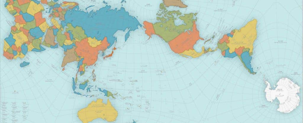
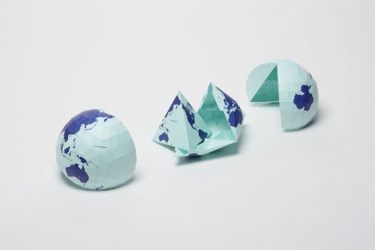
This new design, developed by Hajime Narukawa, is so good that it got Japan’s most prestigious design award – the Good Design Award. It looks pretty weird at first glance, but it’s probably just the orientation. The map works by dividing the globe into 96 equal regions and then transferring those dimensions from a sphere to a tetrahedron, and then, generating the map from those tetrahedra.
“This original mapping method can transfer a spherical surface to a rectangular surface such as a map of the world while maintaining correctly proportions in areas,” says the Good Design Award description.
“AuthaGraph faithfully represents all oceans, continents including the neglected Antarctica. These fit within a rectangular frame with no interruptions. The map can be tessellated without visible seams. Thus the AuthaGraphic world map provides an advanced precise perspective of our planet.”
Of course, this also isn’t perfect – and because the North isn’t necessarily up, it’s probably less than ideal for navigation. But it’s really damn close, and could likely be improved in the future.
“The map [needs] a further step to increase a number of subdivision for improving its accuracy to be officially called an area-equal map,” the Good Design Award description reads.
Was this helpful?


