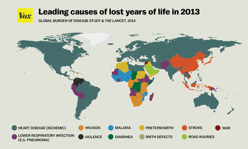
In America and other developed countries, the leading causes of death are heart disease and cancer. Elsewhere, the picture can be a bit more complicated. A report called the Global Burden of Disease study plotted a map where it outlined the leading causes of lost years of life by country. “Cause of lost years of life” and “cause of death” are sensibly different. Cause of lost years of life provides a summary measure of premature mortality. Thus, potential years of life lost may be defined as the years of potential life lost due to premature deaths.

It’s a different manner of putting things into perspective, and this way things that are lost under the surface come out. For instance, even though the leading cause of death in a country might be heart disease, deaths from preterm births or HIV may cause more lost years of life in a country than deaths from heart disease. Looking at this map made by Vox, we also notice some other patterns. What we can find is that heart disease, as leading cause of lost years of life, can be linked with higher income countries, whereas lower income countries are dominated by afflictions like malaria, diarrhea or war.


