Quantcast
ZME Science
  • News
  • Environment
  • Health
  • Future
  • Space
  • Features
  • ZME & more
    • About
    • The Team
    • Advertise
    • Contribute
    • Our stance on climate change
    • Privacy Policy
    • Contact
No Result
View All Result
ZME Science

No Result
View All Result
ZME Science
Home Environment

NASA’s global temperature in 2011 – the big picture

by Mihai Andrei
February 1, 2012
in Environment, World Problems
Share on FacebookShare on TwitterSubmit to Reddit

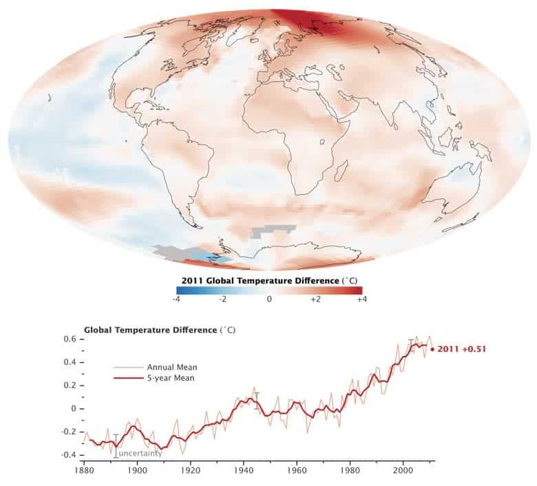
In terms of temperature and not only, 2011 was one of the hottest years in human history – and things aren’t slowing down. Recently, researchers from the NASA Goddard Institute for Space Studies announced their annual analysis of global temperatures.

The picture pretty much speaks for itself; the map shows temperature anomalies, or changes, by region in 2011 and one of the most interesting you can notice from the chart is that out of all the years in the past century, nine of the top ten warmest have been since 2000. Kinda makes you think.

Tags: global warmingworld temperature

ShareTweetShare
ADVERTISEMENT
ADVERTISEMENT
  • News
  • Environment
  • Health
  • Future
  • Space
  • Features
  • ZME & more

© 2007-2021 ZME Science - Not exactly rocket science. All Rights Reserved.

No Result
View All Result
  • News
  • Environment
  • Health
  • Future
  • Space
  • Features
  • ZME & more
    • About
    • The Team
    • Advertise
    • Contribute
    • Our stance on climate change
    • Privacy Policy
    • Contact

© 2007-2021 ZME Science - Not exactly rocket science. All Rights Reserved.

Don’t you want to get smarter every day?

YES, sign me up!

Over 35,000 subscribers can’t be wrong. Don’t worry, we never spam. By signing up you agree to our privacy policy.