Quantcast
ZME Science
  • CoronavirusNEW
  • News
  • Environment
    • Climate
    • Animals
    • Renewable Energy
    • Eco tips
    • Environmental Issues
    • Green Living
  • Health
    • Alternative Medicine
    • Anatomy
    • Diseases
    • Genetics
    • Mind & Brain
    • Nutrition
  • Future
  • Space
  • Feature
    • Feature Post
    • Art
    • Great Pics
    • Design
    • Fossil Friday
    • AstroPicture
    • GeoPicture
    • Did you know?
    • Offbeat
  • More
    • About
    • The Team
    • Advertise
    • Contribute
    • Our stance on climate change
    • Privacy Policy
    • Contact
No Result
View All Result
ZME Science

No Result
View All Result
ZME Science
No Result
View All Result
Home Environment

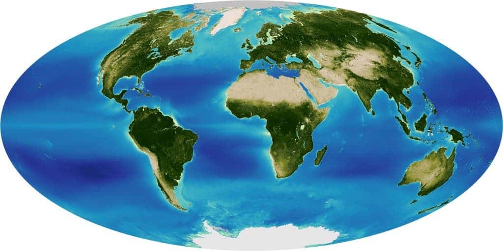
Map of average chlorophyll levels in the world

Mihai Andrei by Mihai Andrei
April 5, 2011
in Environment, World Problems

As you should know, chlorophyll is the biomolecule responsible for turning sunlight into energy; but what you probably don’t know is that a satellite, GeoEye’s OrbView 2 satellite, was launched with the main goal of monitoring chlorophyll levels on the planet. Another interesting fact about this particular satellite is that Google has exclusive online mapping use of it, but that’s another discussion.

But back to our chlorophyll map – it doesn’t only look at levels on land, but also analyzes areas where phytoplankton is most common, which is extremely important to know, as phytoplankton is at the core of all ocean life.

ADVERTISEMENT

NASA’s Earth Observatory explains:

Get more science news like this...

Join the ZME newsletter for amazing science news, features, and exclusive scoops. More than 40,000 subscribers can't be wrong.


It’s the blooming and die-off of the phytoplankton that form the center of the oceanic food web…a direct indicator of the seas’ ability to support life.

It would have been extremely interesting to compare a map like this one to one made about a hundred years ago, to see how the chlorophyll levels have changed, or to be more blunt, dropped. The good news is that we have this data now, and maps like this one will be made in the following years to; hopefully, when we take a look at another map 10 years from now, there will be more green on it, not less.

Via maptd

ADVERTISEMENT

Tags: chlorophyllgoogle satellitesatellite
Mihai Andrei

Mihai Andrei

Andrei's background is in geophysics, and he's been fascinated by it ever since he was a child. Feeling that there is a gap between scientists and the general audience, he started ZME Science -- and the results are what you see today.

Follow ZME on social media

ADVERTISEMENT
ADVERTISEMENT
ADVERTISEMENT
ADVERTISEMENT
  • Coronavirus
  • News
  • Environment
  • Health
  • Future
  • Space
  • Feature
  • More

© 2007-2019 ZME Science - Not exactly rocket science. All Rights Reserved.

No Result
View All Result
  • Coronavirus
  • News
  • Environment
    • Climate
    • Animals
    • Renewable Energy
    • Eco tips
    • Environmental Issues
    • Green Living
  • Health
    • Alternative Medicine
    • Anatomy
    • Diseases
    • Genetics
    • Mind & Brain
    • Nutrition
  • Future
  • Space
  • Feature
    • Feature Post
    • Art
    • Great Pics
    • Design
    • Fossil Friday
    • AstroPicture
    • GeoPicture
    • Did you know?
    • Offbeat
  • More
    • About
    • The Team
    • Advertise
    • Contribute
    • Our stance on climate change
    • Privacy Policy
    • Contact

© 2007-2019 ZME Science - Not exactly rocket science. All Rights Reserved.