Over the course of the pandemic, we’ve been bombarded with all sorts of charts. Charts of total cases, new cases, jobs, economic forecasts, linear and logarithmic data, comparisons — there’s a million ways to look at pandemic data, and not all of it is straightforward.
Most of us think are we pretty good at reading charts, but in reality, most of us are really not. Charts can lie and deceive in a number of ways, either by intention or just by sloppiness. A figure can indeed express complex ideas quickly, but a chart can just as easily mislead or convey the wrong idea. Just like a hammer can be used to build houses, it can also be used to tear down structures.
In his new book How Charts Lie, data viz expert Alberto Cairo takes us on an enlightening journey through the intriguing world of charts, showing not only how charts can deceive us, but how some use this against us.
by Alberto Cairo
W. W. Norton & Company, 352 pages
Buy it on Amazon
Charts are important, there’s no two ways about it. You may think they’re boring, you may find them interesting, but they really matter.
Alberto Cairo’s new book is definitely not boring. As I started the book, I was mentally prepared for a dry presentation of chart-making techniques, riddled with technicalities and good practice tips.
Boy, was I wrong.
Alberto Cairo is a journalist and professor, and judging by How Charts Lie, he’s a storyteller at heart. I read half of the book in one sitting without even realizing it, my curiosity stirred by both the stories and the graphics. The text flows smoothly and is accompanied by excellent data visualization examples. The book also manages to be succinct and rich at the same time, offering enough examples to paint a clear picture without overwhelming.
Here’s an example from How Charts Lie (Cairo has been kind enough to make most of the charts in the book freely available).
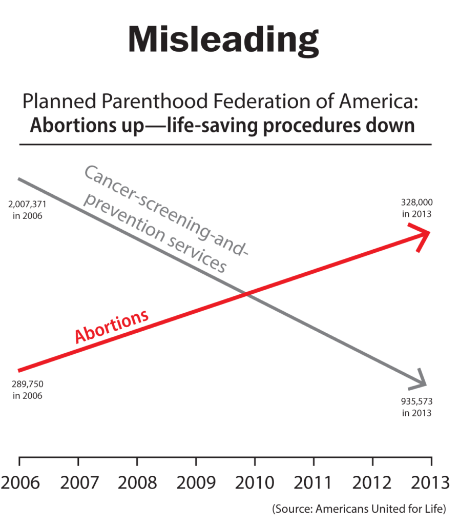
This chart has actually been used in a political debate, aiming to depict that as cancer-screening services are going down, abortions are going up. At first glance, it seems very convincing — but the devil is in the details.
If you look carefully at the figures, one drops from roughly 2 million to 0.9 million, while the other increases from 0.289 million to 0.328. So it’s not exactly an equivalent relationship, even though it’s presented as such. Not even mentioning that this is a pure correlation with no presented causality, the chart is already misleading. Here’s what a more accurate version of the chart would look like:
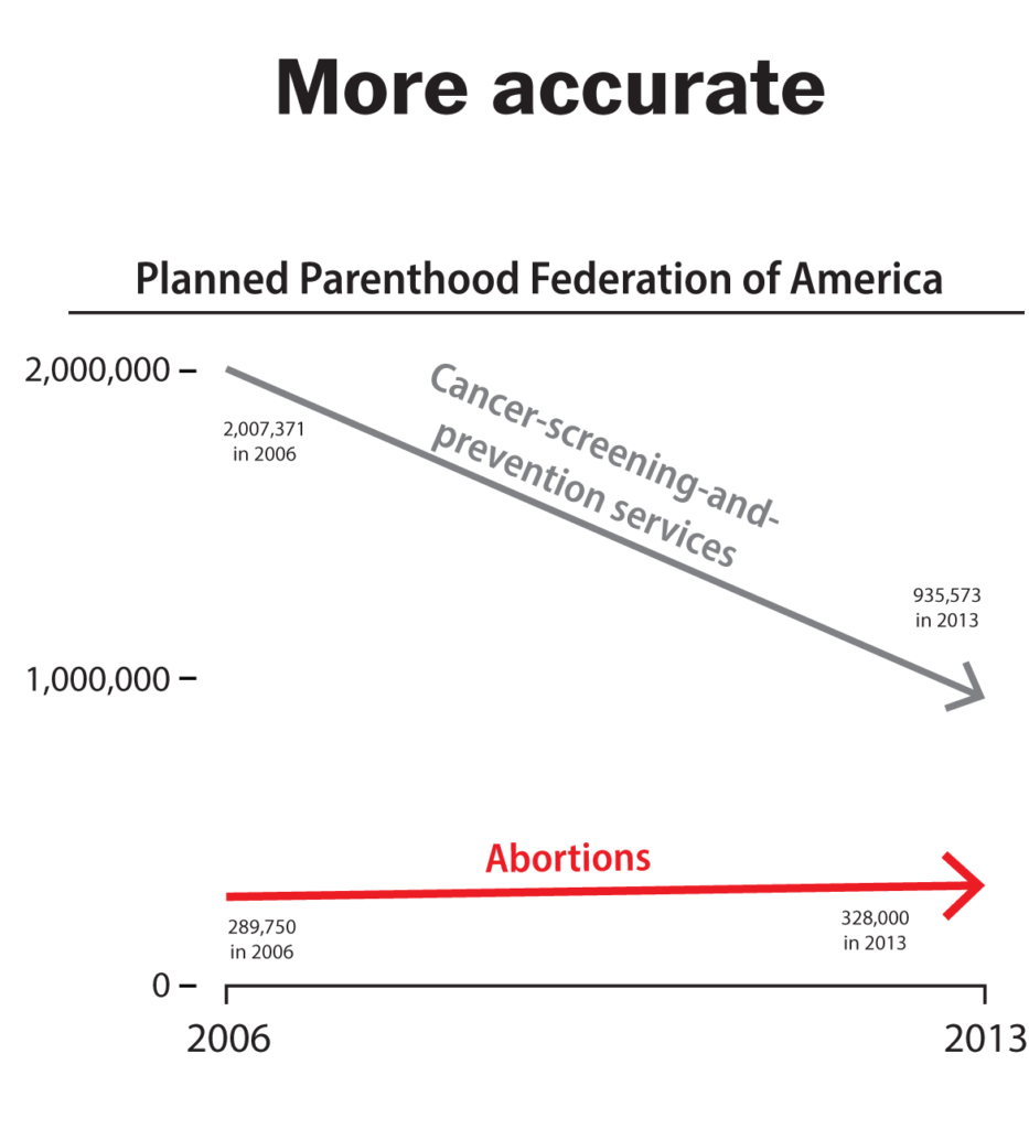
Doesn’t exactly tell the same story, does it? Either by design or by accident, some charts convey a message that is misleading, and if we’re not chart-literate, it’s very easy to be deceived by this.
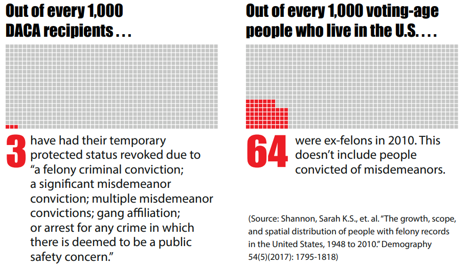
Here’s another striking example. The Deferred Action for Childhood Arrivals (DACA) is a United States immigration policy launched by President Obama in 2012 to protect people who were brought in the US illegally as children. The policy was cancelled by President Trump, and one of the main arguments against it is that DACA recipients are likely to become criminals. Here’s a chart that conveys this:
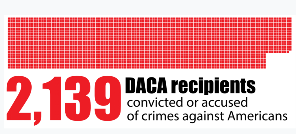
Again, at first glance, it’s convincing. Here are these young aliens committing crimes in the US, so why shouldn’t they be deported?
Well, if you look at the big picture, you’ll see why: because this crime rate is about 20 times lower than the average American.
Sometimes, these charts aim specifically to mislead. Unfortunately, it’s not uncommon to use misleading charts in political debates, especially as we’ve seen in recent years. But more often than not, Cairo argues, it’s not malevolence, but sloppiness that produces imperfect charts.
It’s hard to believe that, over the hundreds of charts we’ve published at ZME Science, all of them are flawless. In fact, the more I think about it, the more I’m certain that that’s not nearly the case. We, like most or all journalists, work with tight time constraints and limited resources, and producing charts is challenging and time-consuming. If we’ve ever come up short, we have only our own sloppiness to blame.
This is why books like How Charts Lie are so important: we’re used to taking a single glance at a chart and producing an interpretation almost instantly, but a chart only shows what it shows — not what we project onto it.
Here’s an example:
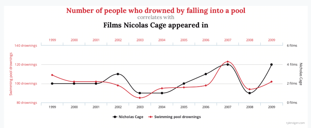
There’s a striking correlation between people drowining in a pool and Nicholas Cage movies. Seemingly, one causes the other, but by all standards of logic, that’s not the case. It’s an obvious example, but what if it had been something less obvious? Sometimes, charts suggest a connection when really, there’s no connection there — and the opposite can also be true in some cases.
I thought How Charts Lie was a book for journalists and data scientists, but I was wrong. It’s a book for anyone who wants to be literate in the language of charts, and that’s something all of us should aim for. It’s a book I wish more people would read.
Was this helpful?


