If you were born today, you’d expect to live to be 79.68 years old — the highest life expectancy recorded ever in the United States, but only the 43rd highest in the world.
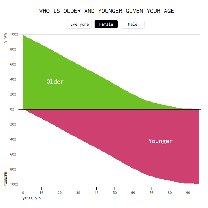
Also, if you were born today you’d be younger than 99% of Americans. Likewise, if you were 88 years old, you’d be older than 99% of Americans.
To check where you stand among the age demographics in the U.S., Nathan Yau of Flowing Data made this interactive chart that’s incredibly easy to use. At 27, I seem to be younger than 39% of Americans and older than 61% of Americans.
Males 35 or 36 years of age are right dead center in between the youngest and oldest Americans while women hit the mark at 38 or 39.
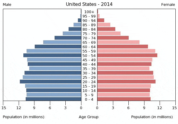
Another great way to visualize age demographics is the population pyramid, which illustrates the age and sex structure of a country’s population. The shape of the population pyramid gradually evolves over time based on fertility, mortality, and international migration trends.
Was this helpful?


