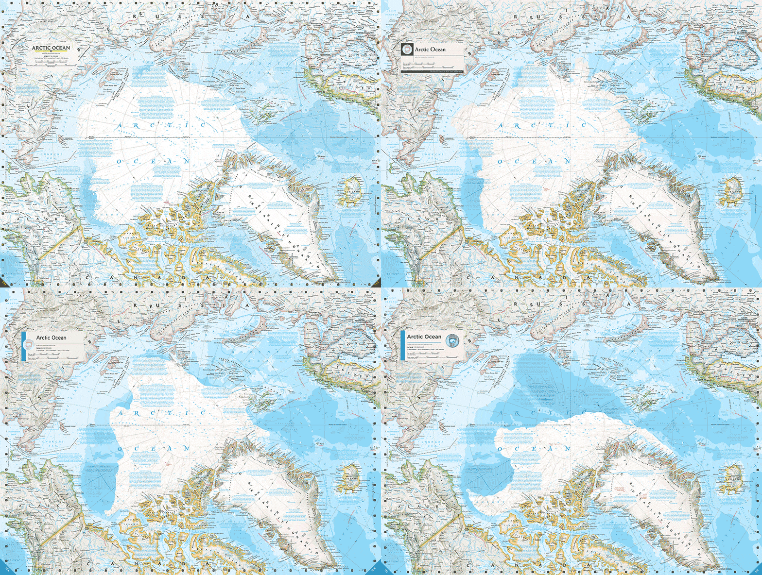
Every five years for more than a century, National Geographic releases an atlas of the world complete with the latest geographic and geologic cartographic representations. The latest edition of Atlas of the World can be quite terrifying if you move up north, in the Arctic, for it shows just how dramatic ice loss has been in the past decades. For comparison, the GIF above stitches three edition (7th and 10th) from 2000 to 2015. The latest caption shows the Arctic as it had been in 2012, during its record low ice extent.

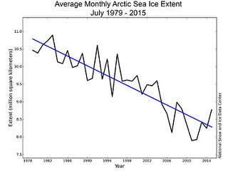
The sea ice extent of September 2012 was 56% lower than that in the same period of 2000, and 65% lower than 1975. The graph on the right shows how sea ice extent has evolved along the years.
As my colleague Andrei puts it:
“Throughout its geological history, the Earth’s climate has changed numerous times – there were times when there were no polar ice caps at all, and there were times when most of the Earth was frozen. But the key word here is “geological” – all these changes occurred over hundreds of thousands of years, if not millions. The climatic changes we are now witnessing are, according to the geological record, unprecedented in terms of speed; we are just now starting to understand the dramatic impact that this temperature shift is having.”
Was this helpful?


