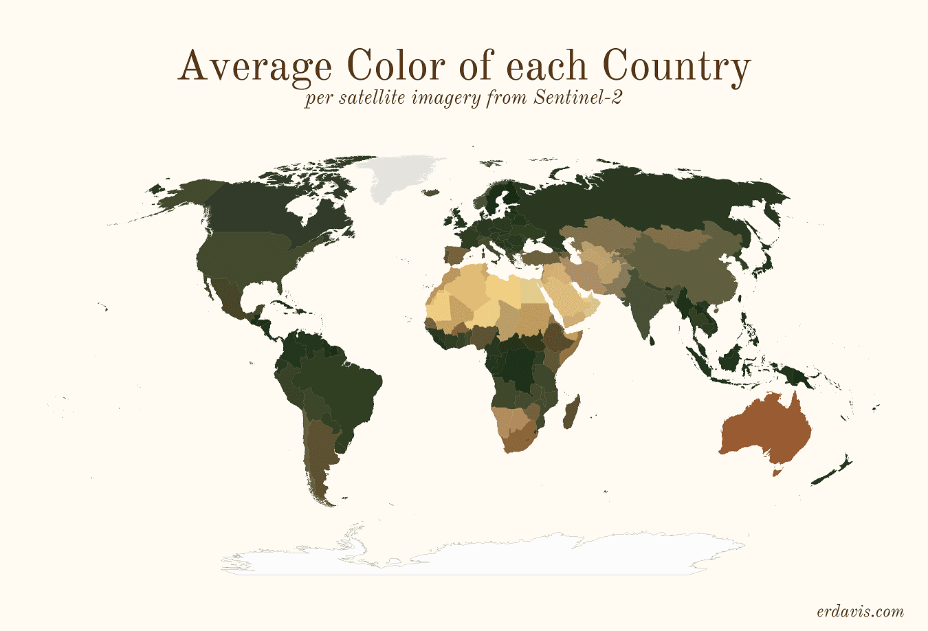
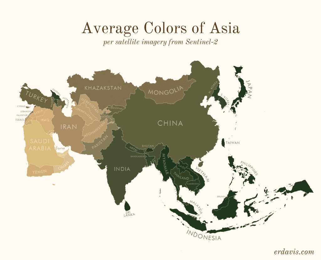
What are the average colors of the world? Data science offers a creative answer
Earth's color palette in a series of creative maps.
In 1972, the Apollo 17 crew snapped one of the most famous photos ever taken, showing the Earth in all its glory for the first time in human history. The image has remained in the public consciousness as the ‘Blue Marble’ since it resembles the spherical agates we used to play with as children. Indeed, more than 70% of Earth’s surface is covered by oceans, reflecting a beautiful blue color.
The rest of terrestrial Earth, however, is much more diverse, from deserts to dense rainforest — and this shows in the richer color palette as seen from space. Data scientist Erin Davis creatively illustrated this color palette in a series of maps showing the dominant color of various regions across the globe.

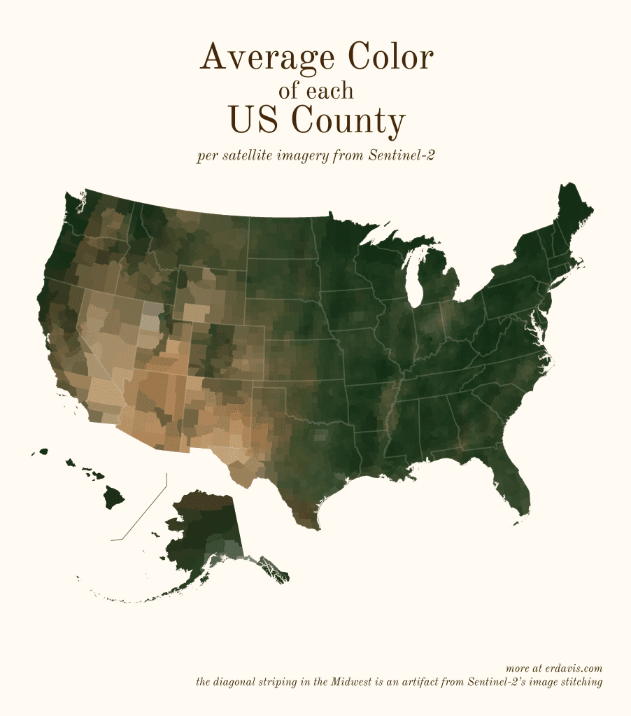
Davis used a dataset from the Copernicus Sentinel-2 mission, a constellation of two identical satellites in the same orbit, each equipped with a high-resolution multispectral imager capable of taking pictures of Earth’s land and vegetation in 13 different bands.
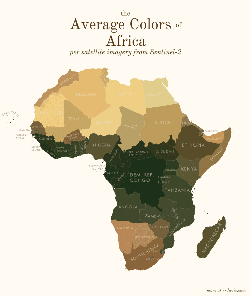
She then ran a script in the R programming language, which she coded herself, that assigned average colors to various areas, whether entire continents, countries, or states in the US.
In a short blog post on her website, Davis explained her process as follows:
- Wrote a script (in R) to find the bounding boxes of all the areas I was interested in
- In R, downloaded pictures of those areas from Sentinel-2
- In R, wrote a script that created a series of commands to:
- Georeference the downloaded image to create a geotiff
- Crop the geotiff to the borders of the area
- Re-project the geotiff to a sensible projection
- Ran that GDAL script
- In R, converted the geotiffs back to pngs, and found the average color of the png
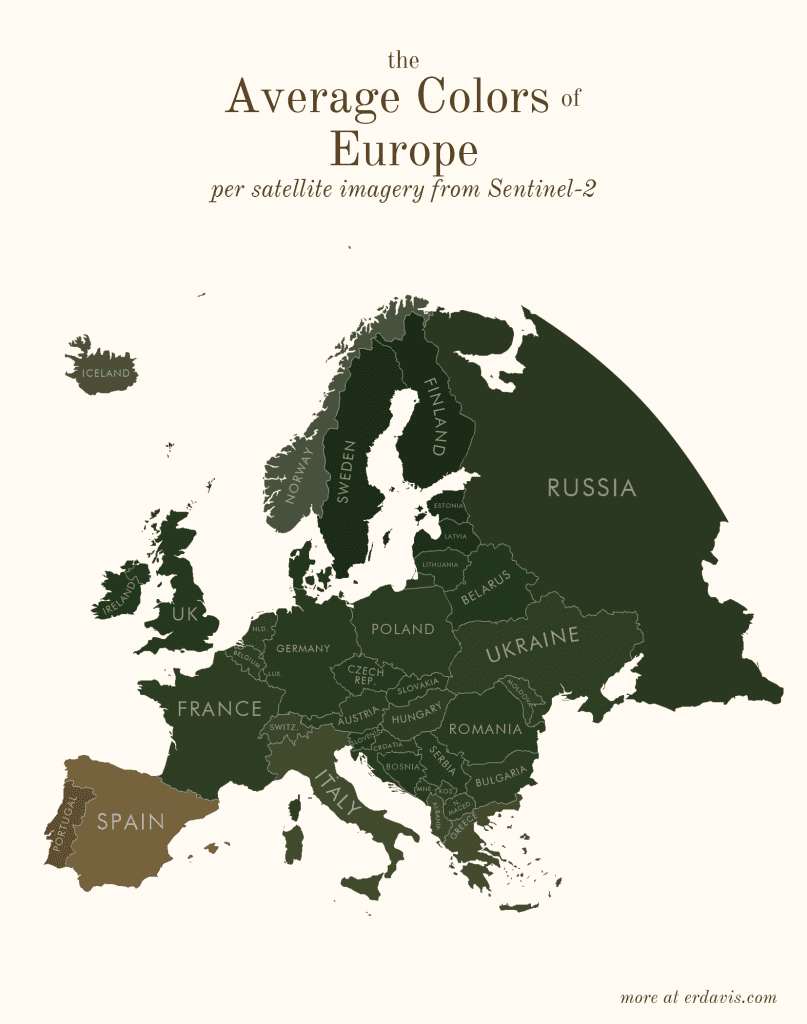
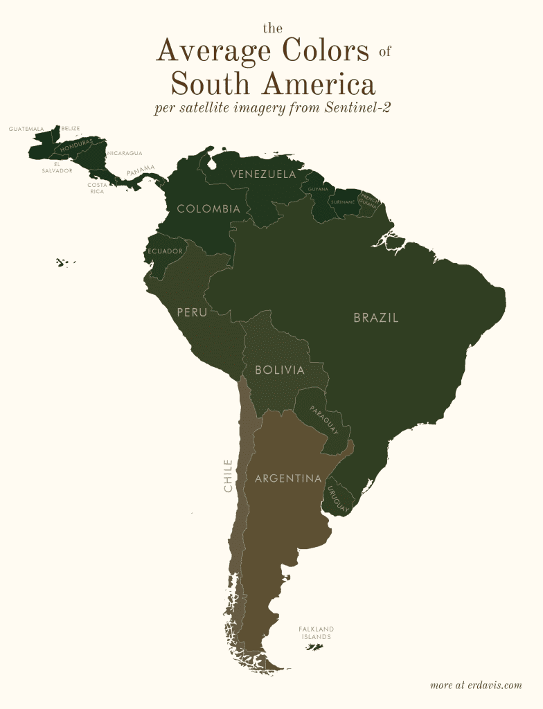
In the same blog post, you can find all the R scripts she used for this project, which you can adapt for your own data visualizations. Contrary to popular belief, data isn’t boring. It can be creative and beautiful with the right mindset.


