New interactive map shows how COVID-19 changed the world
It allows users to track changes in economic activity, climate change and air and water quality, among others
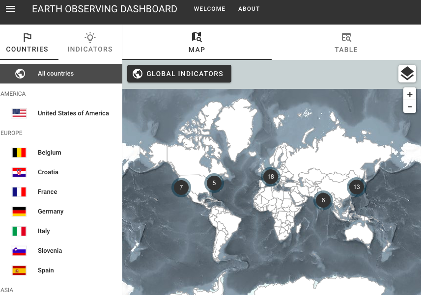
In an unprecedented joint effort, the largest three spaces agencies of the world have joined forces to create a new tool that monitors the impact of the coronavirus around the world in unprecedented detail. The map combines a vast amount of data from Earth-observing satellites and is freely available to the public.
The “COVID-19 Earth Observation Dashboard” was created by the European Space Agency (ESA), Japan Aerospace Exploration Agency (JAXA), and the National Aeronautics and Space Administration (NASA). The agencies formed the project in April and moved fast since then to set up the new online tool.
The dashboard integrates satellite data from the three agencies with analytical tools to allow users to track changes in economic activity, agriculture, climate change and air and water quality. It gives both policymakers and the general public a unique platform to explore the short- and long-term impacts of the pandemic.
ESA’s Director for Earth Observation, Josef Aschbacher, said in a statement: “As the challenges we face from COVID-19 are global by nature, international collaboration among space agencies is key. Through this close cooperation, ESA, NASA and JAXA have created a new centralized platform. Through this, we are making sure that our Earth observation programs deliver their full potential to society.”
The dashboard shows changes in air quality across the globe, one of the first visible impacts of the lockdowns set up to reduce the spread of the virus. The levels of nitrogen dioxide, caused by the fumes from traffic, the burning of fossil fuels and industrial activity, are visible in satellite data and were added to the dashboard.
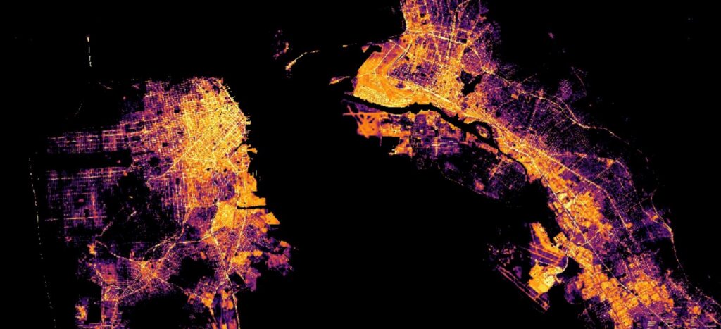
Users can also check out changes in carbon dioxide levels, monitoring how the global and local reaction to the pandemic changed concentrations of this greenhouse gas. Short and long-term changes on a global scale can be observed as well as in selected urban areas such as Delhi, San Francisco and New York.
At the same time, the dashboard includes targeted satellite observations of total suspended matter and chlorophyll concentrations in select coastal areas, harbors, and semi-enclosed bays. This allows users to assess changes in water quality, their spread, and how long they last. Long Island and Tokyo are among the areas examined.
The online tool also provides observations of shipping activity in ports, parked cars, and nighttime lights in urban areas to show how specific sectors of the economy have been affected. Such information is available for Los Angeles, the Port of Dunkirk, Beijing, and several other locations.
Thomas Zurbuchen, an Associate Administrator for NASA’s Science Mission Directorate, said in a statement: “When we began to see from space how changing patterns of human activity caused by the pandemic were having a visible impact on the planet, we knew that if we combined resources, we could bring a powerful new analytical tool to bear on this fast-moving crisis.”
The dashboard uses data from NASA’s satellites Aura and OCO-2, JAXA’s satellites GOSAT and ALOS-2, and the Sentinel missions from the European Copernicus program led by the European Commission. It also incorporates nightlight maps using data acquired by the US Suomi NPP satellite. The dashboard will continue to be updated with new data in the coming months, with new sections in the works.
Online dashboards became popular during the coronavirus pandemic, with many using them for detailed information on the state of the virus. A dashboard created by Johns Hopkins University is updated regularly to show the number of confirmed of coronavirus cases, as well as the number of deaths and those who have recovered.