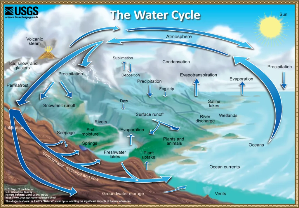
It’s a sight most remember from childhood: a drawing showing the path of water from oceans to clouds to rivers. Long, lavish words like “evapotranspiration” and “precipitation” likely come to mind.
The U.S. Geological Survey (USGS) water cycle diagram is still used by hundreds of thousands of students in the United States and worldwide. It’s also the basis for many, many spin-off diagrams.
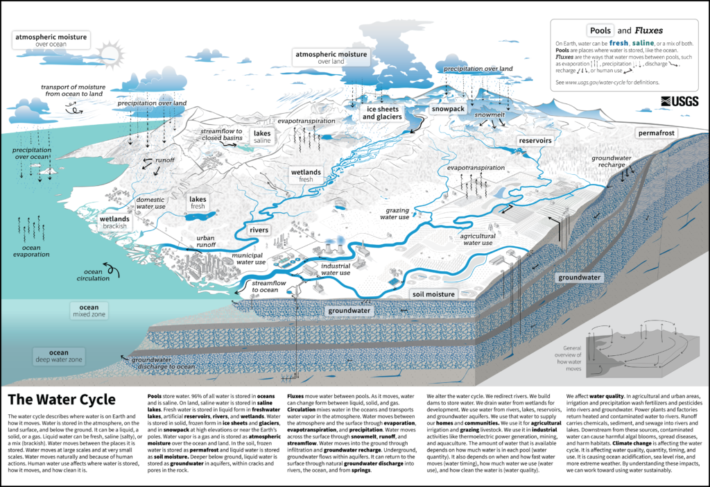
Today, the agency released a new diagram for the first time in more than 20 years, this time with humans as showrunners.
Although people have long siphoned water from groundwater and diverted rivers into farm fields and industrial plants, the new diagram is the first time humans have been included in what was presented until now as a “natural” cycle.
The change reflects the latest 20 years of research uncovering humanity’s central role in the cycle and how to communicate it visually. “We need to change how we think about these things to be able to live and use water sustainably for our future,” said Cee Nell, a data visualization specialist at the USGS VizLab, which designed the diagram.
In addition to natural processes like ocean evaporation, precipitation over land, and runoff, the new diagram features grazing, urban runoff, domestic and industrial water use, and other human activities. Each label in the chart comes from data tracking the significant paths and pools of water worldwide.
“I think overall, this is a great improvement and an important step towards a more comprehensive depiction of the global water cycle,” said ecohydrologist and biogeochemist Stefan Krause at the University of Birmingham, who was not involved in creating the diagram. In 2019, Krause contributed to a Nature Geoscience paper that called into question the lack of human activity or infrastructure in water cycle diagrams. Of 464 diagrams analyzed, only 15% included human interaction with water.
“One misconception that could stem from diagram design is that the water cycle is just one big cycle,” said Nell. The older USGS diagram showed a giant loop with arrows for water movement, for example. “We wanted to communicate that the water cycle is actually composed of many, many smaller cycles that are continuously going in different directions.” Arrows in the new diagram are given a visual prominence similar to labels of pools where water is stored.

One of the most significant ways people use water in the United States is in thermoelectric power plants, where stream water is used as a coolant, said Nell. The water then travels back into the stream, sometimes affecting water quality. A thermoelectric plant was included in the diagram, as well as other features that aren’t labeled. “There are a lot of hidden Easter eggs in there for somebody that really wants to spend time looking,” said Nell.
Krause wishes there were nods to other aspects of human activity, such as altering rivers by straightening channels or using green water, as well as more explanation of some illustrations.
Accessibility drove the diagram’s design, too. Using only one color, blue, alongside a gray scale for labels and landscapes creates a high contrast for visually impaired people, said Nell. The illustration’s target age group is eighth grade, and it will eventually be translated into 60 languages. For now, it is available in English and Spanish.
“We want people to see the water; everything else is secondary. The details are nice, but those are going to be less visually prominent,” said Nell. “The water is the main message.”
This article was originally published in Eos Magazine and was republished here under a CC BY-NC-ND 3.0 license.


